
Bootstrap is an amazing web design framework that makes it easy to build responsive websites quickly and easily. Bootstrap was originally developed by Twitter to get more consistency across websites. Since it was released as an open-source framework in 2011, it has become one of the most popular web frameworks.
Nowadays, several users are moving away from desktop towards mobile therefore, a lot of websites need to be responsive.
Now, responsive is probably not the best term for what this means as a lot of people think that responsiveness means that the website will load up immediately or it has to be fast but that's not what responsive is at all. Responsiveness just means that it responds to the viewport. That means if you are looking at the same website on a mobile or on an iPad it should have a different layout to be able to best take advantage of the screen.
Now, What does it allow you to do?
Imagine you need a website with an attractive navigation bar, stylish buttons, nice typography, placeholders for text and images, a slider, and more-yet you aren’t a front-end developer. But what if these features were already coded for you, and you just had to write a little HTML to use them? This is Bootstrap. All the JavaScript code and CSS classes needed are already included in the Bootstrap package.
1. Bootstrap Skeleton
<!DOCTYPE html>
<html>
 <head>
 <title>Bootstrap 101 Template</title>
 <meta name="viewport" content="width=device-width, initial-scale=1.0">
 <!-- Bootstrap -->
 <link href="css/bootstrap.min.css" rel="stylesheet">
 </head>
 <body>
 <h1>Hello, world!</h1>
 <!-- jQuery (necessary for Bootstrap's JavaScript plugins) -->
 <script src="https://code.jquery.com/jquery.js"></script>
 <!-- Include all compiled plugins, or just specific files as needed -->
 <script src="js/bootstrap.min.js"></script>
 </body>
</html>
2. Uses of Bootstrap
- Bootstrap has built-in classes, so you don't have to create most elements from scratch.
- It’s open-source.
- It's very flexible and can be used to create any type of website in no time at all.
- Websites made with bootstrap are faster, more responsive, and mobile-friendly.
- Bootstrap supports JavaScript plugins.
3. Features of Bootstrap
- Bootstrap is compatible with all modern browsers.
- Bootstrap is the 3rd highest starred open project on GitHub.
- Bootstrap provides a powerful grid system
- Bootstrap provides simple integration
- Bootstrap has good community support as well as documentation documentation
- Bootstrap has pre-styled components
- Bootstrap is easy to learn and use as anybody with just basic knowledge of HTML and CSS can start using Bootstrap.
- Bootstrap uses a cache system in which we do not have to install it on our computer. After connecting to the internet once, it makes a cache of its files and stores them in the web browser.
4. Alerts - Bootstrap
- A bootstrap alert is a message sent to users when something goes wrong.
- In the case of typos such as incorrect email addresses or credit card numbers, the user will receive an error alert message that prompts them to make corrections.
Example:
<!DOCTYPE html>
<html lang="en">
<head>
  <title>Bootstrap Example</title>
  <meta charset="utf-8">
  <meta name="viewport" content="width=device-width, initial-scale=1">
  <link rel="stylesheet" href="https://maxcdn.bootstrapcdn.com/bootstrap/3.4.1/css/bootstrap.min.css">
  <script src="https://ajax.googleapis.com/ajax/libs/jquery/3.5.1/jquery.min.js"></script>
  <script src="https://maxcdn.bootstrapcdn.com/bootstrap/3.4.1/js/bootstrap.min.js"></script>
</head>
<body>

<div class="container">
  <h2>Alerts</h2>
  <div class="alert alert-success">
    <strong>Success! alert</strong>
  </div>
  <div class="alert alert-info">
    <strong>Info! alert</strong>
  </div>
  <div class="alert alert-warning">
    <strong>Warning! alert</strong>
  </div>
  <div class="alert alert-danger">
    <strong>Danger! alert</strong>
  </div>
</div>
</body>
</html>
| Tag Name | Description | Code |
|---|---|---|
| Alert-primary | Light blue coloured alerts can be created using alert-primary. | |
| Alert-secondary | Light grey coloured alerts can be created using alert-primary. | |
| Alert-Success | For successful actions. | |
| Alert-Danger | For warning messages. | |
| Alert-warning | Similar to a warning alert, a danger alert is issued in response to more negative actions (e.g., being locked out after too many password failures). | |
| Alert-heading | Alert-heading is used for adding heading to your alert. | |
| Alert-Light | Alert-Light is used to display alerts in a light colour. | |
| Alert-Dark | Alert-dark is used to display alerts in dark colours. | |
| Alert-Link | Alert-link class can be added to any links inside the alert box to create "matching coloured links. | |
| Alert-Dismissible | Alert-dismissible is used to close the alert after reading. | |
5. Buttons - Bootstrap
Responsive buttons can be built with the latest bootstrap 5.
Example:
| btn | Btn is used for setting the size and spacing of the button. | |
|---|---|---|
| btn-primary | Btn-primary is used to display buttons with a particular style for each class, for example, primary displays buttons with blue background. | |
| btn-secondary | Btn-secondary is used to displays buttons with a grey background. | |
| btn-success | Btn-success displays button with green background. | |
| btn-info | Used for information on a topic like terms and conditions. | |
| btn-warning | Btn-warning is for the yellow background button. | |
| btn-danger | Btn-danger is for the red background button. | |
| btn-light | Btn-light is a light coloured button. | |
| btn-dark | Btn-dark is a dark coloured button (black). | |
| btn-link | Btn-link removes the outer border while maintaining the spacing set by the .btn class. | |
| btn-outline-primary | A button variation to have outlined buttons instead of a solid background. | |
| btn-outline-secondary | A button variation to have outlined buttons instead of a solid background. | |
| btn-outline-success | A button variation to have outlined buttons instead of a solid background. | |
| btn-outline-info | A button variation to have outlined buttons instead of a solid background. | |
| btn-outline-warning | A button variation to have outlined buttons instead of a solid background. | |
| btn-outline-danger | A button variation to have outlined buttons instead of a solid background. | |
| btn-outline-light | A button variation to have outlined buttons instead of a solid background. | |
| btn-outline-dark | A button variation to have outlined buttons instead of a solid background. | |
6. Breadcrumb - Bootstrap
- Breadcrumbs help users navigate from one page to another without getting lost and let them return to a previous page if they get lost.
- Breadcrumb navigation provides links back to each previous page the user navigated through and shows the user's current location in a website.
| Breadcrumb | Breadcrumb is used for indicating the current page's location within a navigational hierarchy. | |
|---|
7. Badges - Bootstrap
Bootstrap badges are used for adding additional information.
Example:

<!DOCTYPE html>
<html lang="en">
<head>
  <title>Bootstrap Example</title>
  <meta charset="utf-8">
  <meta name="viewport" content="width=device-width, initial-scale=1">
  <link href="https://cdn.jsdelivr.net/npm/bootstrap@5.1.3/dist/css/bootstrap.min.css" rel="stylesheet">
  <script src="https://cdn.jsdelivr.net/npm/bootstrap@5.1.3/dist/js/bootstrap.bundle.min.js"></script>
</head>
<body>

<div class="container mt-3">
  <h2>Badges</h2>
  <h1>Welcome to InterviewBit<span class="badge bg-secondary">New</span></h1>
</div>

</body>
</html>
| Tag Name | Description | Code |
|---|---|---|
| badge | Add a badge of the same size as the previous parent element. | |
| badge-pill | Badge-pill is used for making badges more rounded. | |
| badge-primary | Badge-primary is used to add a batch to the primary message. | |
| badge-secondary | Badge-secondary is used to add a batch to the secondary message. | |
| badge-success | To display a badge indicating success. | |
| badge-warning | Badge style to indicate a warning. | |
| Badge danger | Badge style to indicate danger. | |
| badge-light | Badge style to indicate light background. | |
| badge-dark | Badge style to indicate dark background. | |
8. Cards - Bootstrap
We have cards in Bootstrap that are simple containers that can hold images and descriptions. Below are some of the functions associated with a card.
| card | Inside the div, each card is wrapped inside the card class. | |
|---|---|---|
| card-body | card-body holds the content of the card. | |
| card-title | Card-title holds the title of the card. | |
| card-subtitle | Card-subtitle is used for adding subtitles. | |
| card-text | card text class wraps the container around card text. | |
| card-link | card-link is used for adding a link to a card. | |
| card-img-top | The main card image is shown on the top. | |
| middle image | No need to specify the card image class as top or bottom when displaying an image in the middle, just add the image tag. | |
| card-img-bottom | Image is displayed after card content. | |
| card-img-overlay | For displaying image in the background. | |
| card-header | card-header is used to add header bootstrap for a card. | |
| card-footer | Footer bootstrap for the card. | |
| card-columns | To the wrapping div of the masonry-like collection of cards, the .card-columns class is added. | |
| card bg-... text-... | It is used to style the cards by formatting with different colors. | |
9. Pagination - Bootstrap
Pagination helps to display the different page numbers of a website. With the help of paginators, we can jump to any page of the website.
| pagination | Add basic pagination to display only certain records on one page. | |
| page-item disabled | To disable a particular page number or item from being clicked. | |
| page-item active | To indicate the currently active page item. | |
| pagination-lg | Display larger size pagination blocks. | |
| pagination-sm | Display smaller size pagination blocks. | |
10. Carousel- Bootstrap
A slideshow component that cycles through elements - images or slides of text - like a carousel.
| carousel slide | Carousel slide adds animation and CSS transition effect. | |
|---|---|---|
| carousel-fade | Carousel-fade is used to animate the slide transition with a crossfade instead of a slide. | |
| carousel-inner | Carousel-inner contains individual slides to the carousel. | |
| carousel-item | The wrapper class is applied to each individual carousel item in the div. | |
| carousel-caption | Carousel-caption adds caption for individual slides (carousel-item). | |
11. Collapse - Bootstrap
With JavaScript plugins, you can change the visibility of content across your project with the help of collapse.
Example:
 <!DOCTYPE html>
<html lang="en">
<head>
  <title>collapse in bootstrap</title>
  <meta charset="utf-8">
  <meta name="viewport" content="width=device-width, initial-scale=1">
  <link href="https://cdn.jsdelivr.net/npm/bootstrap@5.1.3/dist/css/bootstrap.min.css" rel="stylesheet">
  <script src="https://cdn.jsdelivr.net/npm/bootstrap@5.1.3/dist/js/bootstrap.bundle.min.js"></script>
</head>
<body>

<div class="container mt-3">
  <h2>collapse in bootstrap</h2>
  <p>Click on the button to toggle between showing and hiding content.</p>
  <button type="button" class="btn btn-primary" data-bs-toggle="collapse" data-bs-target="#demo">Simple collapsible</button>
  <div id="demo" class="collapse">
  Learn bootstrap
  </div>
</div>

</body>
</html>| collapse | Display and hide content whenever needed. | |
|---|---|---|
| Accordion bootstrap 4 | Used to Build vertically collapsing accordions in combination with our Collapse JavaScript plugin. | |
12. Dropdowns - Bootstrap
Dropdowns are toggleable, contextual overlays that display lists of links and more. They allow the user to choose one value from a predefined list.
Example:
 <div class="dropdown">
  <button class="btn btn-secondary dropdown-toggle" type="button" id="dropdownMenuButton" data-toggle="dropdown" aria-haspopup="true" aria-expanded="false">
    Dropdown button for bootstrap
  </button>
  <div class="dropdown-menu" aria-labelledby="dropdownMenuButton">
    <a class="dropdown-item" href="#">Bootstrap cheatsheet</a>
    <a class="dropdown-item" href="#">Bootstrap 5 cheatsheet</a>
    <a class="dropdown-item" href="#">Bootstrap 4 cheatsheet</a>
  </div>
</div>| dropdown | Using this class, you can add a dropdown to the navbar, tabs, and pills so that you can display additional navigation. | |
|---|---|---|
| dropright | dropright is used to display the dropdown menu on the right side. | |
| dropleft | dropleft is used to display the dropdown menu on the left side. | |
| dropdown-header | Dropdown-header is used to add headers inside the dropdown menu. | |
| dropdown-divider | Dropdown-divider creates a thin horizontal border between links to separate them. | |
| dropdown-menu-right | Adds the default styles for the dropdown menu container. | |
13. Forms - Bootstrap
A form is a common tool of HTML which is used to collect data from the user.Bootstrap allows us to style forms.
Example:
<form>
  <div class="form-group">
    <label for="exampleInputEmail1">Email address</label>
    <input type="email" class="form-control" id="exampleInputEmail1" aria-describedby="emailHelp" placeholder="Enter email">
    <small id="emailHelp" class="form-text text-muted">We'll never share your email with anyone else.</small>
  </div>
  <div class="form-group">
    <label for="exampleInputPassword1">Password</label>
    <input type="password" class="form-control" id="exampleInputPassword1" placeholder="Password">
  </div>
  <div class="form-check">
    <input type="checkbox" class="form-check-input" id="exampleCheck1">
    <label class="form-check-label" for="exampleCheck1">Check me out</label>
  </div>
  <button type="submit" class="btn btn-primary">Submit</button>
</form>| form-group | When added as a wrapper around each input type or form control, it creates a stacked form with proper margins. | |
|---|---|---|
| form-inline | All elements are inline in the form along with left margins | |
| form using the grid | uses rows and columns | |
| form-control | form-control is the default class for styling <input>, <select> and <textarea> elements. | |
| form-control-lg | large size | |
| form-control-sm | small size | |
| form-control-file | form-control-file is used to upload a file | |
| form-control-plaintext | to have read only contents in the form without losing the styling. | |
| form-control-range | Form-control-range is used to include range element. | |
| form-check | Form-check is used for creating a checkbox input. | |
| disabled items | disabled items add items that cannot be clicked. | |
| readonly | Readonly adds read only text. | |
14. Grid System - Bootstrap
- Bootstrap Grids can be used to build layouts of all shapes and sizes.
- Bootstrap’s grid system uses a series of containers, rows, and columns to layout and aligns content. It’s built with a flexbox and is fully responsive.
- The grid system can adapt across all 6 default breakpoints, and any breakpoints you customize. The six default grid tiers are:
- Extra small (xs)
- Small (sm)
- Medium (md)
- Large (lg)
- Extra large (xl)
- Extra extra large (xxl)
| container | container for the grid. | |
|---|---|---|
| container-fluid | fluid container for full-width. | |
| row | row elements of the grid. | |
| col-# ( <576px) | a column with specified width. | |
| col-sm-# ( ≥576px) | small columns with specified width. | |
| col-md-# ( ≥768px) | medium column. | |
| col-lg-# ( ≥992px) | large column | |
| col-xl-# ( ≥1200px) | extra large column. | |
| col | equal size column. | |
| col-* | equal width columns – col-sm, col-md, col-lg, col-xl. | |
| no-gutters | remove horizontal padding between columns and margins between rows. | |
| offset-*-# | small, medium, large or extra large offsets with size. | |
| order-# | order in which the column should appear. | |
| nested columns | columns inside column. | |
15. Jumbotron - Bootstrap
This component can increase the size of headings and add a lot of margin for landing page content. For using Jumbotron: simply create a container with the class of .jumbotron.
- A jumbotron was introduced in Bootstrap 3 as a big padded box used to draw attention to special content or information.
- Jumbotrons are no longer supported in Bootstrap 5.
- For the same effect, you can use a <div> element with special helper classes combined with a colour class:
| Jumbotron | Using a jumbotron a big box was created to give focus on some special information. | |
|---|
17. Tables - Bootstrap
Using tables in bootstrap, you can aggregate a huge amount of data and present it in a clear, logical manner.
You just need to add the base class .table, then extend with custom styles or modifier classes.
Example:
Basic Table bootstrap 4
The .table class is used to add basic styling (light padding and only horizontal dividers) to a table:
| Firstname | Lastname | |
|---|---|---|
| Lavish | malik | lavishmalik28@gmail.com |
| John | dellinger | jogndellinger01@gmail.com |
<!DOCTYPE html>
<html lang="en">
<head>
  <title>Bootstrap Example</title>
  <meta charset="utf-8">
  <meta name="viewport" content="width=device-width, initial-scale=1">
  <link rel="stylesheet" href="https://maxcdn.bootstrapcdn.com/bootstrap/3.4.1/css/bootstrap.min.css">
  <script src="https://ajax.googleapis.com/ajax/libs/jquery/3.5.1/jquery.min.js"></script>
  <script src="https://maxcdn.bootstrapcdn.com/bootstrap/3.4.1/js/bootstrap.min.js"></script>
</head>
<body>
<div class="container">
  <h2>Basic Table bootstrap 4</h2>
  <p>The .table class adds basic styling (light padding and only horizontal dividers) to a table:</p>
  <table class="table">
    <thead>
      <tr>
        <th>Firstname</th>
        <th>Lastname</th>
        <th>Email</th>
      </tr>
    </thead>
    <tbody>
      <tr>
        <td>Lavish </td>
        <td>malik</td>
        <td>lavishmalik28@gmail.com</td>
      </tr>
      <tr>
        <td>John</td>
        <td>dellinger</td>
        <td>jogndellinger01@gmail.com</td>
      </tr>
    </tbody>
  </table>
</div>
</body>
</html>| table | The table is used for adding a basic table. | |
|---|---|---|
| thead-light | Provides a light header background for the table header. | |
| thead-dark | Provides a dark header background for the table header. | |
| table-striped | Used for alternate dark and light table backgrounds. | |
| table-bordered | ruled table. | |
| table-borderless | Remove borders. | |
| table-hover | The .table-hover class is used to add a hover effect on table rows. | |
| table-sm | Table with a small size. | |
| table-*-responsive | Makes a table responsive by cropping a wide table and making it scrollable horizontally.Can be sm,md,lg or xl. | |
| table-secondary | (bootstrap table styles)It adds blue background to table. | |
| table-success | (bootstrap table styles)It adds specific colour background to the table. | |
| table-info | (bootstrap table styles)It adds blue background to the table. | |
| table-warning | (bootstrap table styles)It adds yellow colour background to table. | |
| table-danger | (bootstrap table styles)It adds red/pink background to table. | |
| table-light | (bootstrap table styles)It adds light background to table. | |
| table-dark | (bootstrap table styles)It adds dark (grey/black) background to table. | |
18. Border Utilities - Bootstrap
You can quickly style an element's border and border-radius by using border utilities. These are great for images, buttons, or any other element.
Example:
| border | Used to add a border. | |
|---|---|---|
| border-*-0 | It represents no border. Variations – border-top-0 represents no border on top, in similar way bottom, right and left are possible. | |
| border-* | It allows you to add/remove borders on a side as well as change the colour of the borders.border-(light, dark primary, secondary, transparent, white, warning, success, info, danger, 0, top-0, right-0, left-0, bottom-0). | |
| rounded | rounded refers to the rounded image border. | |
| rounded-sm | rounded-sm refers to small rounded edges. | |
| rounded-lg | rounded-lg refers to large rounded edges. | |
| rounded-circle | rounded-circle refers to a rounded circular image. | |
| rounded-0 | rounded-0 refers tono rounding (sharp edges). | |
19. Display - Bootstrap
We can quickly Quickly and responsively toggle the display value of components and more with the help of display utilities.
| d-*-block | display block with a specific styling. | |
|---|---|---|
| d-*-flex | display flex items with a specific styling. | |
| d-*-inline | inline display with a specific styling. | |
| d-*-inline-block | display inline-block. | |
| d-*-inline-flex | styling for inline flex. | |
| d-*-none | hide display for certain elements (same as display: none). | |
| d-*-table | display styling for the table. | |
| d-*-table-cell | styling for a table cell. | |
| d-print-... | controls how elements have to be displayed while printing. Value can be none, block, inline, inline-block, table, table-row,table-cell, flex, inline-flex. | |
20. Colors - Bootstrap
Use a handful of colour utility classes to convey meaning through color.Supports styling links with hover states, too.
Example:
| bg-primary | It is used to add a blue background. | |
|---|---|---|
| bg-secondary | It is used to add a grey background. | |
| bg-success | It is used to add a green background. | |
| bg-info | It is used to add a light blue background. | |
| bg-warning | It is used to add a yellow background. | |
| bg-danger | It is used to add a red background. | |
| bg-light | It is used to add a light (white or light grey) background. | |
| bg-dark | It is used to add a black (dark) background. | |
| bg-white | It is used to add a white background. | |
| text-* | Specific colours for the text are used. There are different types of values: primary, secondary, info, success, danger, warning, white, light, dark. | |
21. Sizing - Bootstrap
With width and height utilities, you can easily make an element as wide or tall as its parent.
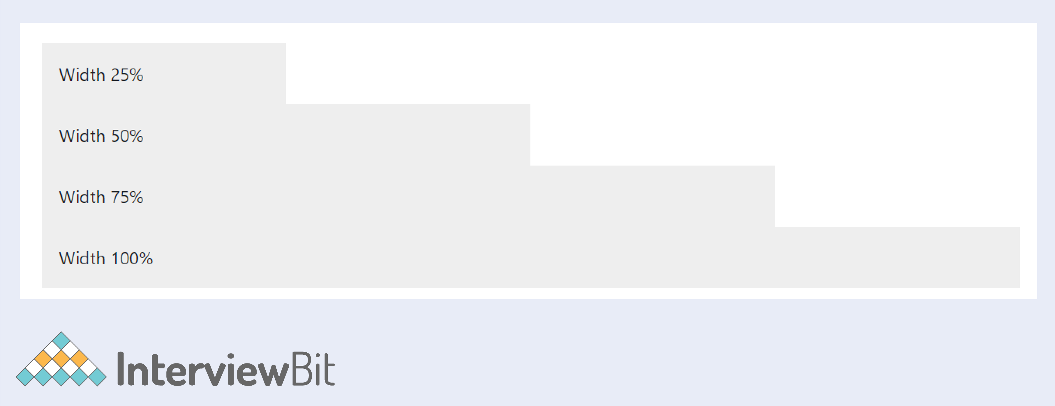
| w-* | Utility class that makes an element's width a percentage of its parent's width. | |
|---|---|---|
| h-* | It provides customized height for the div tag. | |
| mw-* | It provides a maximum width. | |
| mh-* | It provides maximum height. | |
22. Spacing - Bootstrap
Bootstrap includes a wide range of shorthand responsive margin, padding, and gap utility classes to modify an element’s appearance.
| m-1 / m-*-# | spaced div tags with margin on all sides; star ranges from 0 space to 6 spaces. | |
|---|---|---|
| mt-1 / mt-*-# | the margin on top. | |
| mr-1 / mr-*-# | the margin on right. | |
| mb-1 / mb-*-# | bottom margin. | |
| ml-1 / ml-*-# | left margin. | |
| mx-1 / mx-*-# | left and right (x-axis) margin. | |
| my-1 / my-*-# | top and bottom (y-axis) margin. | |
| m-n1 / m-*-n# | negative spacing (change of direction) – can be any of the above – left, right, top, bottom, x, y. | |
| p-1 / p-*-# | padding on all sides. | |
| pt-1 / pt-*-# | padding on top. | |
| pr-1 / pr-*-# | padding on right. | |
| pb-1 / pb-*-# | padding on bottom. | |
| pl-1 / pl-*-# | padding on left. | |
| px-1 / px-*-# | padding on left and right (x-axis). | |
| py-1 / py-*-# | padding on top and bottom (y-axis). | |
23. Flexbox - Bootstrap
The main difference between Bootstrap 3 and Bootstrap 4 & 5 is that Bootstrap 5 now uses flexbox, instead of floats, to handle the layout.
Bootstrap 5 provides us with classes to let us use flexbox easily.
| flex-*-column | flex column to display content vertically (top to bottom). Responsive variations are sm,md,lg,xl. | |
|---|---|---|
| flex-*-column-reverse | reverse the order of display of columns. | |
| flex-*-row | display content horizontally one after the other (side-by-side). Responsive variations are sm,md,lg,xl. | |
| flex-*-row-reverse | reverse the order of display of rows. | |
| flex-*-nowrap | default setting to display text in the flex container. | |
| flex-*-wrap | add wrap functionality. Responsive variations – sm, ml, lg, xl | |
| flex-*-wrap-reverse | reverse order display. | |
| flex-fill | fill the background with different colors – primary, secondary, info etc… | |
| flex-*-grow-1 | lets the specified element take the entire available space. | |
| flex-*-grow-0 | don’t let the items grow on different screens | |
| flex-*-shrink-1 | lets the item shrink. | |
| flex-*-shrink-0 | no shrinking on different screens. | |
| justify-content-*-start | change the alignment of the items (justify to left). | |
| justify-content-*-end | justify to the end (right). | |
| justify-content-*-center | center justify the items. | |
| justify-content-*-between | justify between the items. | |
| justify-content-*-around | justify space around the items. | |
| align-content-*-start | control vertical alignment to start (default). | |
| align-content-*-end | align content to end. | |
| align-content-*-center | align content to the center. | |
| align-content-*-around | align space around items. | |
| align-content-*-stretch | stretch individual flexbox items. | |
| align-items-*-baseline | align-items with respect to baseline. | |
| align-items-*-stretch | stretch items to the full width of the flex container. | |
| align-self-*-start | self-align individual flex items to start (default). | |
| align-self-*-end | self-align individual flex item to end. | |
| align-self-*-center | self-align individual flex item to centre. | |
| align-self-*-baseline | self-align individual flex item to baseline. | |
| align-self-*-stretch | stretch to full width | |
| order-*-# | change the order of display of particular flex items from 0-12. | |
Conclusion:
In this bootstrap cheat sheet, you can find all the information you need while learning HTML and front-end development. Furthermore, it can be used as a reference when building a project using the popular HTML framework.
Bootstrap MCQ Questions
Which of these codes will create a standard navigation bar?
Which class in bootstrap allows you to have a full-width container, which spans the entire width of the viewport?
A bootstrap form's default layout is which of the following?
Which of the following is correct about the bootstrap 5 Modal Plugin?
The Dropdown menu in bootstrap can be created by which of the following classes?
In regards to Bootstrap Mobile-First Strategy, which of the following is true?
Which of the following is correct? (bootstrap 3 vs bootstrap 4).
A button at the block level can span the entire width of an element's parent. Which class should be used?
Which one of the following plugins are used to cycle through elements, such as a slideshow?
Identify the three elements of the Bootstrap grid listed in the correct order.
What class should the container element for elements with COL class have?


0 Comments