To specify formatting within an HTML document (fonts, layout, background, colours, etc. ), authors have to apply separate tags to different parts to format. The term CSS pertains to Cascading Style Sheets, which are used to specify your document's style. While HTML is utilized for structuring a web page (the headlines and paragraphs, as well as the ability to include images, video, and other elements), CSS specifies your page layout, colours, and fonts. CSS is used to bring style to your web pages.
TYPES OF CSS:
There are 3 types of CSS
- External CSS
- Internal CSS
- Inline CSS
1. External CSS: For using an external style sheet, your .html files need to include a header section that links to an external style sheet. Since the CSS code is in a separate document, your HTML files will have a cleaner structure and are smaller in size.
You can use the same .css file for multiple pages.
For example:
<head>
<link rel=”stylesheet”  type=”text/css”  href=mysitestyle.css”>
</head>
2. Internal CSS: These CSS instructions are written directly into the header of a specific .html page. This CSS style is an effective method of styling a single page.
For example:
<head>
<style>
Body  {  background-color:thistle;  }
P  {  font-size:20px;  color:mediumblue;  }
</style>
</head>
3. Inline CSS: Lastly, inline styles are CSS blocks that are written directly into a single instance of HTML code.
For example:
<h1 style=”font-size:55px;color:orange;”>Check out this headline!</h1>The most efficient way of implementing CSS on a website is to use external style sheets, whereas internal style sheets and inline styles are suitable for case-by-case changes.
What is CSS Syntax?
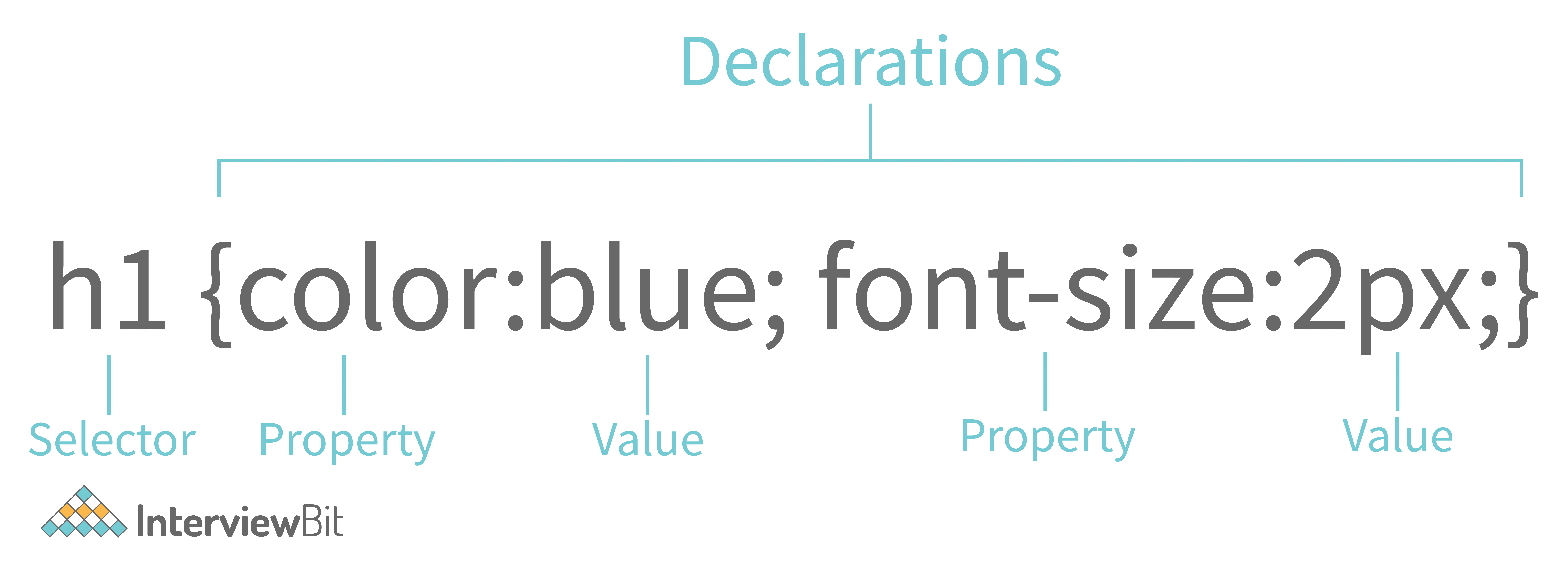
CSS syntax is relatively simple. Various attributes, such as font size and background colour, are assigned values within the brackets following the name of the element to style, called the CSS selector.
What are CSS Selectors?
A CSS property value pattern is a pattern of elements, such as HTML elements, that instruct the browser which elements to select when applying the CSS property values.
1. CSS Selectors
| COMMAND | DESCRIPTION | SYNTAX |
|---|---|---|
| UNIVERSAL SELECTOR | The CSS universal selector (*) matches elements of any type. When utilising @namespace, universal selectors can be namespaced. | |
| ID SELECTOR | The CSS ID selector matches an element based on the value of the element’s id attribute. This is what you'd use to refer to that one-of-a-kind element with an id. | |
| CLASS SELECTOR | The CSS class selector matches elements based on the contents of their class. | |
| TYPE SELECTOR | It selects all elements of the given type within a document. In other words, the type selector in CSS matches components based on their node names. | |
| ADJACENT SIBLING SELECTOR | The adjacent sibling combinator (+) separates two selectors. It comes right after the first element, and they're both children of the same parent. | |
| CHILD SELECTOR | The child combinator (>) is placed between two CSS selectors. | |
| GENERAL SIBLING SELECTOR | Select all elements that follow the first element such that both are children of the same parent. | |
| DESCENDANT SELECTOR | Any selector with white space between two selectors without a combinator. | |

2. Pseudo-classes and Pseudo-elements
A pseudo-class is used to define a special state of an element. A CSS pseudo-element is used to style specified parts of an element.
| COMMANDS | DESCRIPTION | SYNTAX |
|---|---|---|
| Mouse over selector | Triggered when the user hovers over an element with the cursor. You can use the hover selection to target an element that a user hovers over with their cursor. | |
| Active Link Selector | The :active pseudo-class is commonly used on <a> and <button> elements. When a link is clicked, you can provide a style for it with this selector. | |
| Focus Selector | Triggered when the user clicks or taps on an element or selects it with the keyboard's Tab key. | |
| Visited Links Selector | Represents that the link has already been visited. Its styles for URLs that the user has already visited are defined. | |
| Link Selector | This represents that the link has not yet been visited. | |
| Checked selector element | Represents radio, checkbox, or option element that is checked or toggled to an on-state. When the page loads, it specifies that an <input> element should be already selected (checked). | |
| Disabled elements selector | An element is disabled. It represents that the element is currently disabled, To pick the disabled element, the :disabled selector is used. | |
| Enabled elements selector | An element is enabled. It represents that the element is currently available. | |
| Not a Specified Element Selector | Represents elements that do not match a list of selectors. | |
| First Line Selector | Applies styles to the first line of a block-level element. It is used in the first line of an element to style it. | |
| First Letter Selector | Applies styles to the first letter of the first line. The style is applied to the first letter of the first line of a block-level element if it is not preceded by other content. | |
| First Child Selector | Represents the first element among a group of sibling elements. It is used to find all elements that are children of a given element. | |
| Last Child Selector | Represents the last. It indicates the last sibling element in a collection of siblings. | |
| Only Child Selector | Represents an element without any siblings. You can use the CSS:only-child selector to target an element which is the only child of its parent. | |
| :nth-child Selector | Matches elements based on their position. | |
| First Element of its Parent Selector | Represents the first element. In CSS, you may use the:first-of-type selector to target an element's first appearance within the container. | |
| Elements that have no Children Selector | Represents any element that has no children. Any element with no children is represented by this. Either element nodes or text can be children. | |
| Before Element | Used to add cosmetic content to an element with the content property.The::before pseudo-element is used to define created stuff that comes before the content of an element. | |
| After Element | Used to add cosmetic content to an element with the content propertyThe::after pseudo-element is used to define created stuff that comes after the content of an element. | |
3. CSS Text Styling
| COMMAND | DESCRIPTION | SYNTAX |
|---|---|---|
| Font style | It sets the font style. We can set our text as normal, bold, italic, oblique as per our requirement | |
| Font Variant | It sets the font variation. We can set the variant of the font as uppercase or lowercase, small-caps etc as per required by the user. | |
| Font Weight | Sets the font weight. It helps us to set the weight of the font as normal, bold, bolder lighter and we can also set it in numerics. | |
| Vertical Alignment | Sets the alignment i.e. where text is shown. It will help to adjust our text where it will appear. | |
| Text Transform | It sets how text is written. It will define the text as uppercase, lowercase or capitalized. | |
| Font Size | It sets the font size. It helps us to define the size of our font to make our web page more attractive. | |
| Space Between Characters | It defines the space between characters. It helps to adjust the spacing between two characters. | |
| Line Height | It sets the height of the line. It defines the height of the line. | |
| Horizontal Alignment | Sets the horizontal alignment of the content. It helps to align the text horizontally whether it is left, right, centre or align. | |
| Text Align Last | The text-align-last CSS property specifies how the last line of a block or line should be oriented before a forced line break. | |
| Text Decoration | Text-decoration-line, text-decoration-color, text-decoration-style, and the newer text-decoration-thickness are all shorthand for this property. | |
| Indent First Line | The indentation of the initial line in a text block is controlled by the text-indent attribute. | |
| Font Family | Sets the font family of the text by linking the font families from google to the HTML. | |
| Text Justify | Specifies the justification method of text when text-align is set to "justify". | |
| Text Overflow | Sets how hidden overflow content is signalled to the user. | |
| Text Shadow | Sets the shadow of text in any direction. | |
4. CSS Table
| COMMAND | DESCRIPTION | SYNTAX |
|---|---|---|
| Adding Borders to Tables | The CSS border property is the best way to define the borders for the tables. | |
| Adjusting spacing inside Tables | You may easily use the CSS padding property to provide additional space between the table cell contents and the cell borders. | |
| Setting Table Width and Height | The width and height CSS properties can also be used to specify the table's width and height, as well as the width and height of its cells. | |
| Controlling table layout | This property specifies the layout algorithm for table cells, rows, and columns. | |
| Horizontal Alignment of Cell Contents | You may use the text-align property in the same manner you do with other components to position text inside table cells horizontally. | |
| Vertical Alignment of Cell Contents | Similarly, you may use the CSS vertical-align property to align the content inside the th> and td> elements to the top, bottom, or center. | |
| Making a Table Responsive | Tables aren't naturally responsive. You may add responsiveness to your tables by allowing horizontal scrolling on tiny displays to support mobile devices. Simply enclose your table in a div> element and use the overflow-x: auto; style. | |
5. CSS Position
| COMMAND | DESCRIPTION | SYNTAX |
|---|---|---|
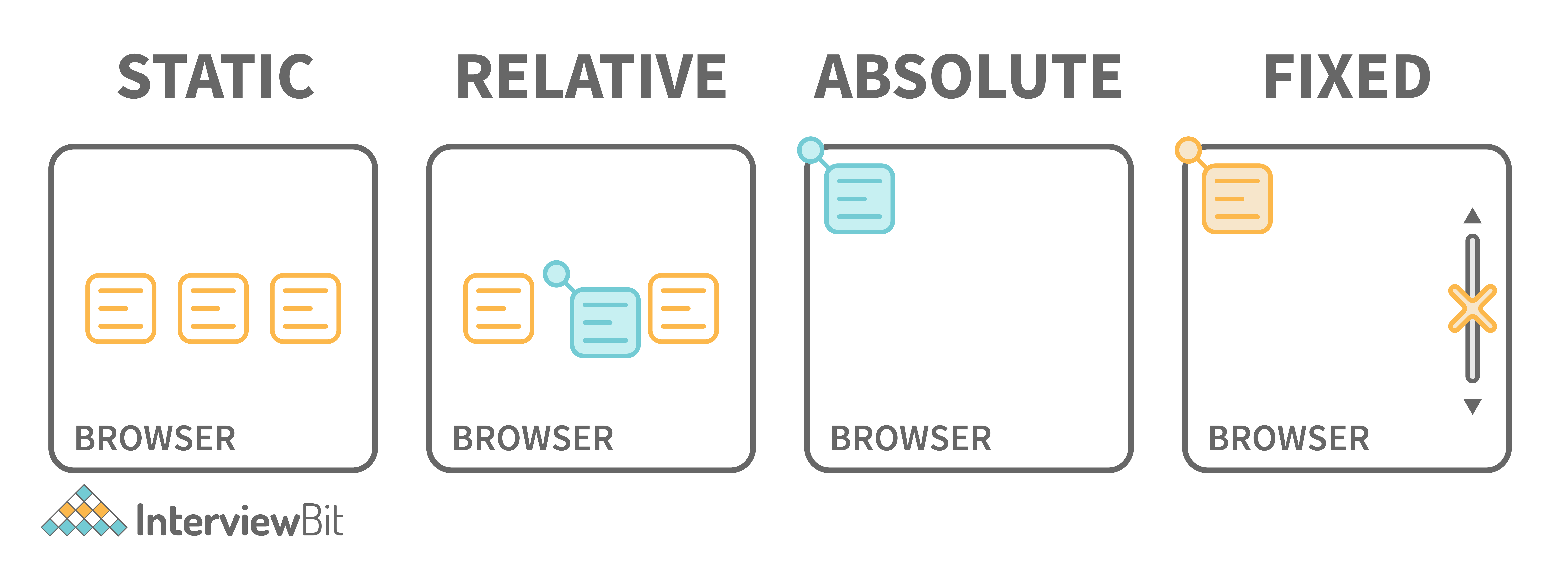
| Position | Set the position of the elements in a document. | |
| Position Properties | Defines the position of an element in a document. | |
| Float Element | Defines the position of an element in a document text and inline elements to wrap around. | |
| Clear Floating Elements | Whether an element must be moved below (cleared) floating elements that precede it. | |
| Z Index | Sets overlapping elements with a larger z-index cover those with a smaller one. | |

6. CSS Background
| COMMANDS | DESCRIPTION | SYNTAX |
|---|---|---|
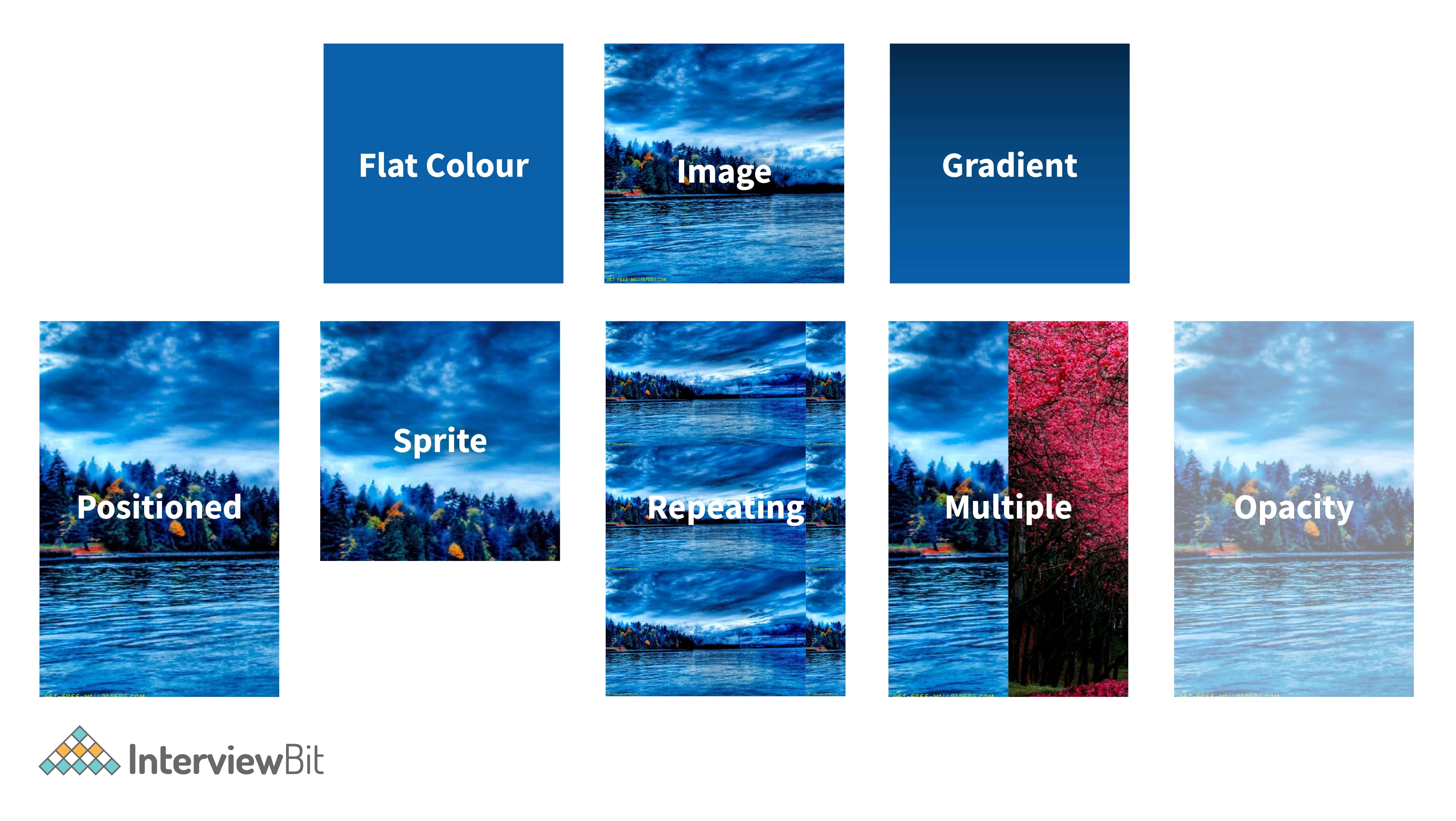
| Background Image | Sets the background image in a div. An element's background-image attribute specifies one or more background images. | |
| Background Repeat | Sets whether the background is to be repeated or not, in other words, it determines whether or not the background picture will be repeated. | |
| Background Attachment | Sets the background image scroll or fixed. CSS's background-attachment attribute controls how the background moves in relation to the viewport. | |
| Background Color | Set the background colour of the div or container. | |
| Background Position | Sets the position of the background. | |
| Background Opacity | The opacity property specifies the opacity/transparency of an element. It can take a value from 0.0 - 1.0. The lower value, the more transparent it is. | |
Different properties and how it works:

7. CSS Box Model
| COMMAND | DESCRIPTION | SYNTAX |
|---|---|---|
| Box Sizing | Sets the width and height of the box. Building CSS layouts with the box-sizing property may be a lot more straightforward. | |
| Margin | Sets the margin from all the sides of the box. This CSS tutorial explains how to use the CSS property called margin with syntax and examples. | |
| Padding | Sets the area inside the box from the content. CSS's box-sizing attribute determines how the box model is applied to the element to which it applies. | |
| Border Color | Sets the colour of the border of the box. | |
| Border Style | Sets the style of the border. | |
| Border Width | Sets the width of the border. The width of an element's borders is determined by the border-width attribute. The value of this characteristic can range from one to four. | |
For example, in the following code,
img{
      Border-radius: 8px:
}
The output will look like the below:

For this code
img{
     Border-radius: 50px:
}
Output for the above code looks like the below:

8. CSS Styling Lists
| COMMANDS | DESCRIPTION | SYNTAX |
|---|---|---|
| List Type | It sets the type of list. The List is of many types. You can select the type of list you want to add whether it is an ordered or unordered list. | |
| List Position | Sets the position of the list. | |
| List Image | Sets the background image of the list. | |
9. CSS Flexbox
| COMMAND | DESCRIPTION | SYNTAX |
|---|---|---|
| Flex Direction | Sets how flex items are placed in the flex container. | |
| Flex Wrap | Sets whether flex items are forced onto one line or can wrap onto multiple lines. | |
| Justify Content | Defines how the browser distributes space between and around content items. | |
| Align Items | It sets the align-self value on all direct children as a group. | |
| Align Content | Sets the distribution of space between and around content. | |
| Order | Sets the order to lay out an item in a flex or grid container. | |
| Flex Grow | It sets the flex-grow factor. Flex-grow is a term that refers to a system that allows you to The flex-grow factor of a flex item's main size to be controlled by the CSS property flex grow factor. | |
| Flex Shrink | It sets the flex shrink factor of a flex item. The flex-shrink is a method of reducing the size of a flexible object The flex-shrink factor of a flex item is controlled by the CSS attribute. | |
| Flex Basis | Sets the size of the content box. The flex-basis is a system that allows you to change your mind at any A flex item's initial primary size is determined by a CSS attribute. Unless box-sizing is used, it determines the size of the content box. | |
| Align Self | It aligns the item inside the grid area. | |
Let's understand flexbox with an example:
 Code:
.flex-container {
    display: flex;
}
Output:

10. CSS Grid
| COMMAND | DESCRIPTION | SYNTAX |
|---|---|---|
| Grid Template Columns | Specifies the size of the columns, and how many columns are in a grid layout. | |
| Grid Template Rows | Specifies the size of the rows in a grid layout. | |
| Grid Template Areas | Specifies how to display columns and rows, using named grid items. | |
| Grid Template | Property for defining grid columns, rows, and areas. | |
| Grid Column Gap | Sets the size of the gap between columns. | |
| Grid Row Gap | It sets the size of the gap between an element's grid rows. The space between rows is known as the row gap. The gap between an element's grid rows is controlled by this attribute. | |
| Justify Items | Defines the default justify-self for all items of the box. | |
| Align Items | Sets the align-self value on all direct children as a group. | |
| Justify Content | Specifies how the browser distributes space between and around content. | |
| Align Content | Distribution of space between and around content items. | |
| Grid Auto Columns | Specifies the size of an implicitly-created grid column track or pattern of tracks. | |
| Grid Auto Rows | CSS property specifies the size of an implicitly-created grid row track or pattern of tracks. | |
| Grid Auto Flow | Property controls how the auto-placement algorithm works. | |
| Grid Column Start | CSS property specifies a grid item’s start position within the grid column. | |
| Grid Column End | Specifies a grid item’s start position within the grid column by contributing a line, a span. | |
| Grid Row Start | A grid item’s start position within the grid row by contributing a line. | |
| Grid Row End | Specifies a grid item’s end position within the grid row by contributing a line. | |
| Grid Column | Specifies a grid item's size and location within a grid column by contributing a line. | |
| Grid Row | Specifies a grid item’s size and location within the grid row. | |
| Justify Self | Sets the way a box is justified inside its alignment container along the appropriate axis. | |
| Align Self | Overrides a grid or flex item's align-items value. | |
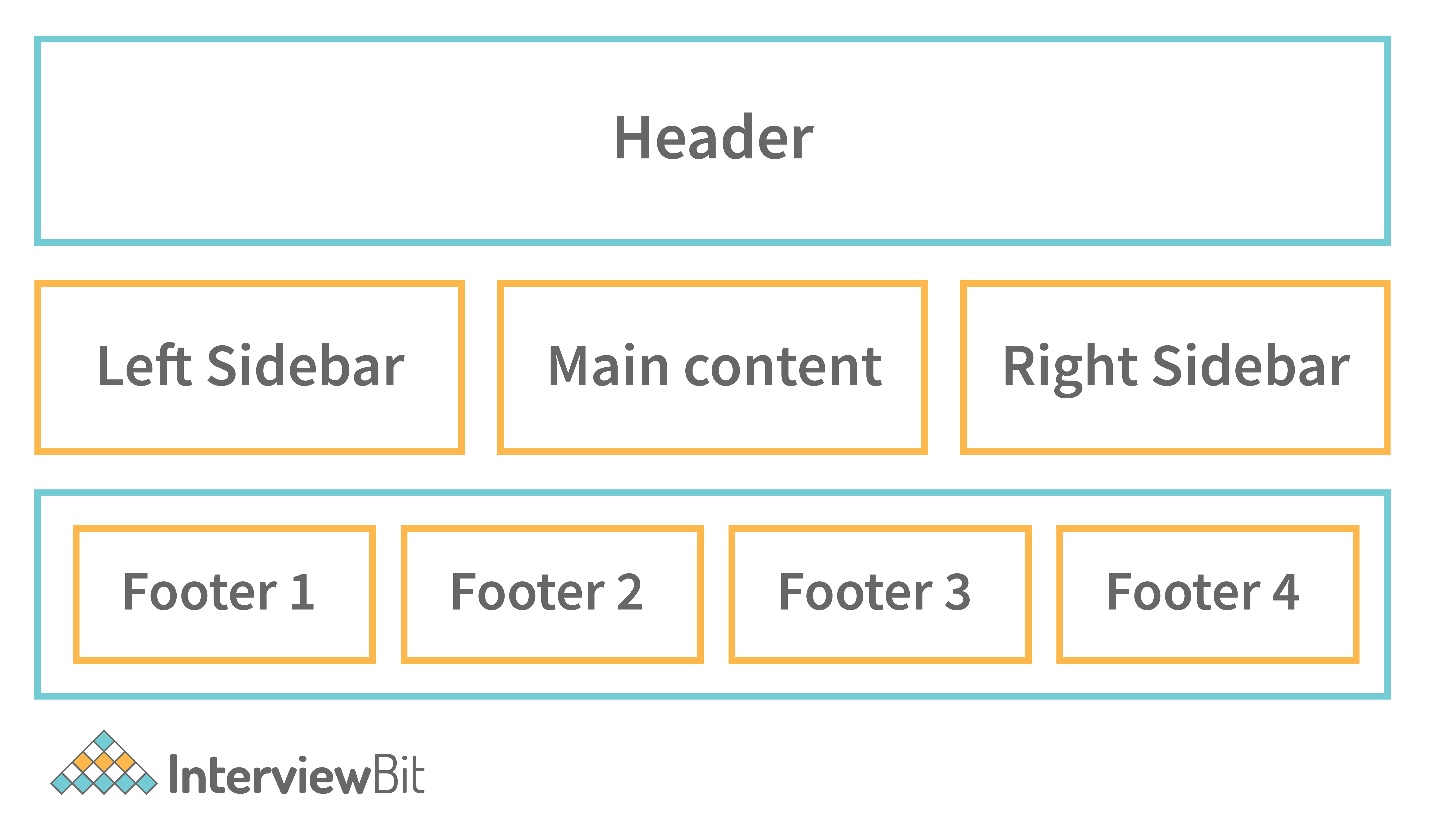
HOW A GIRD LOOKS LIKE:

11. CSS Content(Dynamic)
| COMMAND | DESCRIPTION | SYNTAX |
|---|---|---|
| CSS Variable | Used in other declarations using the var() function. | |
| Variable Usage | Used in other declarations using the var() function. | |
| Counter Reset | Create a new counter or reversed counter with the given name on the specified element. | |
| Counter Increment | Increases or decreases the value of a CSS counter by a given. | |
| Counter Dynamic Value | Adjust the appearance of content based on its location in a document. | |
| Attribute Dynamic Value | Adjust the appearance of content based on its location in a document. | |


0 Comments